Making of "Bumbo The Great"
By Prince of the Obsessed Maniacs / TRSi
Designing a GFX for a diskmag is some kind of a special honour for me. People recognize my work and I was quite proud when the HUGI team asked me if I had some spare-image on my harddrive. Well, actually I didn't. Reason enough to paint some.
Well, any image has its own kind of workflow. There isn't one particular way I follow when it comes to create a new image. Luckily I do that kind of stuff long enough to have some kind of archive I used to gather in my hotel-room at one of the latest parties. It contains snippets and parts of my high-resolution GFX I use to present here, there and everywhere. And it's comfortable to browse those images when it comes to gather stuff for a new idea. I usually take some screenshot that has an interesting color-shape and use to blow it up to massive resolutions in order to get the most details out of it.
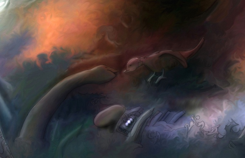
For the actual image I chose a template that's occupying my HD for some 5 years now. I always wanted to work out this image but never really had the time to. It's some kind of cheesy bird/snake pictures I got a whole series of. Never released but ready to be worked on.
It's the colours that fascinated me most. The motif itself couldn't be more trivial. But, hey - I usually don't waste my time thinking about motives... It's the painting process that tends to enhance the whole idea of an image. And so I did what's left to do to enhance a mediocre idea into a fancy image: Painting structures in order to have some room to let the mind flow and turn those structures into props or characters.
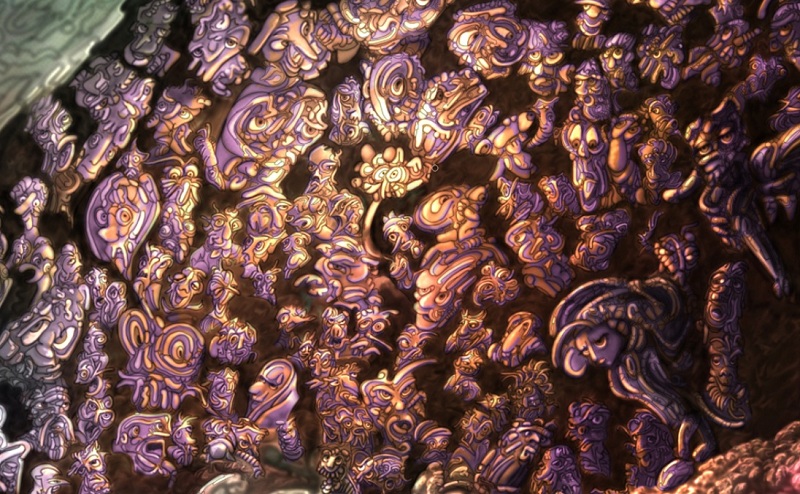
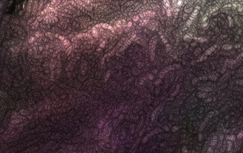
You see? Every part of the image has a structure. Usually I just darken the edges of what I think *could* be some kind of structure. It's an unconscious way of painting. Quite boring at times, but a bottle of white dry wine and an excellent audio-book sweeten that kind of process. The two characters you see here are pointed out just by lighten/darken those structures. Therefore the lightsource has to be determined quite at the beginning.
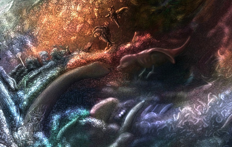
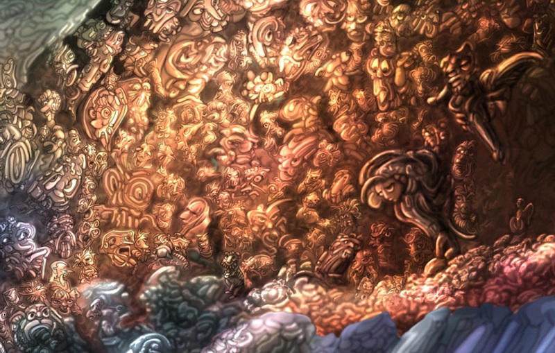
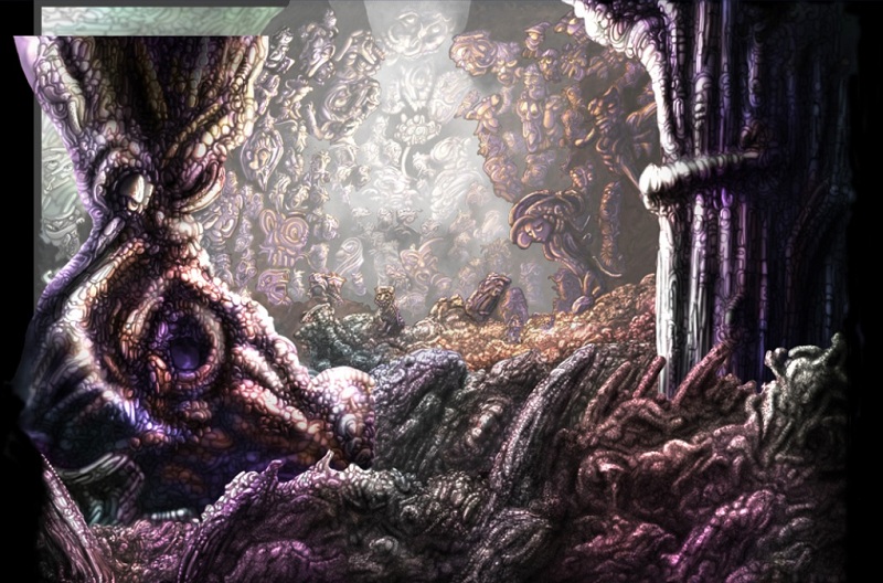
A whole structured image usually looks like a pain in the ass unless you begin to devide it into seperate areas. Before doing that those areas need to be defined. The bright yellow area in the background offers good opportunity to integrate one of my trademarks: Faces. At this stage I don't know what the final image will look like, but integrating faces always is a good idea to get some nice and high detailed background.
Once having created a plane of creatures there's need of defining some main lightsource. In this case it's the "flower" in the middle of that area. every part of the final image will take this area as the center of light.
Time to work out some colours. Shading the single parts usually is enough to achive some kind of depth. Playing with colours enhance that kind of effect. And it's not as much effort as one might think. Just clone your plane, correct it to the complementary color and erase everything that is ought to be lightend. That's it.
But what's bright has to be brightened. And so I cut my image in various layers. Every layer needs to be colour-corrected. In order to brighten them all the dark tones have to be erased. You can do that with a simple colour-correction. It still adds some kind of depth into the image.
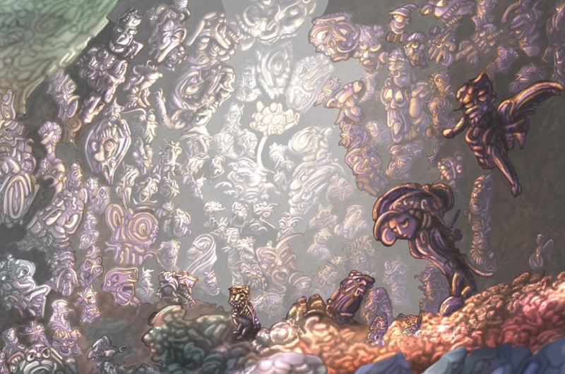
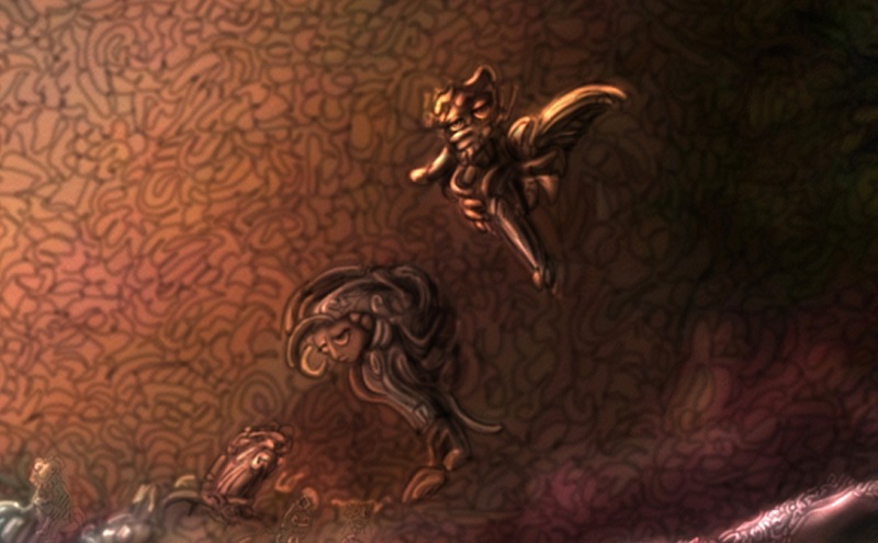
The background seems to be working. Not yet ready. But nice enough to be working. Time to think about the sujet again. The snake/bird thing was kind of too cheesy in my oppinion. So I decided to revisit my archive in order to get a leading character that leads the viewer into the scene. It's "Bumbo" I chose. Yes, some of my images do have strange names. For this it's "Bumbo the satisfyied".
But the light situation isn't correct on him. So there's quite a bit of work to do to correct that. With brightening up some details and darken others it's possible to complete reverse a lightsituation.
Fortunately only parts of that character have to be reworked. Adding some more details makes the single layers glue together, by the way.
Oh, those structured details. Most important for my kind of style, but actually somewhat annoying to paint. After it's done, of course, it's nice to have a base which lets you play around for a while finding some characters or props. It's quite interesting that when you work on those parts of the image on different days your mood seems to be captured. I could process the same image over and over again and it surely wouldn't look the same after all.
Maybe it's time to do a series of small images that prove.
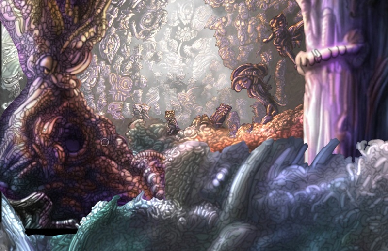
Back to the main image... I added some landscapish details to the foreground and colourcorrected them to fit into the final image.
Overall the image turns out to have quite a composition. Nice. At this stage of work I didn't even waste a thought on that. But it works. There's only two things missing. I tend to give the viewer an intimate view to the scene. Therefore quite often I use to implement some kind of frame consisting of plants or branches. Usually it breaks up the image's hard edges. There's nothing quite as boring as a rectangled image. Setting a frame gives the opportunity to smoothly blend in the image at it's edges. Yet it's aspect is rectangled but the edges are black and the frame spots the image.
Oh! Yes! And the HUGI-team wants me to implement a logo. I'm not that much of a logoartist, so I decide to visit their website to get some. Want a logo? Pfrt. Here you are.
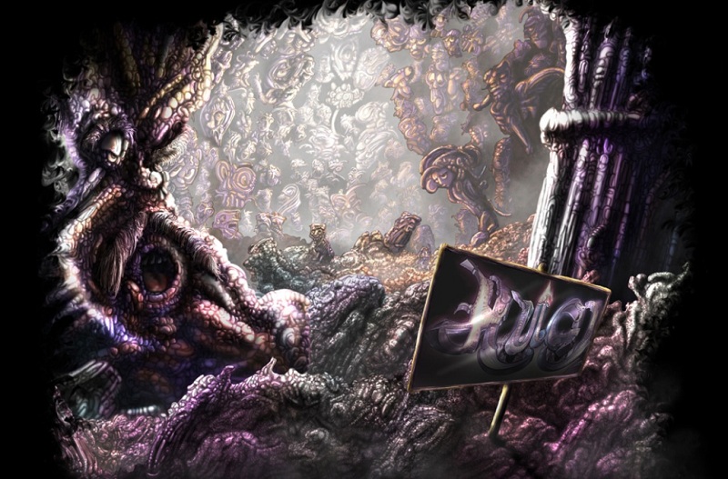
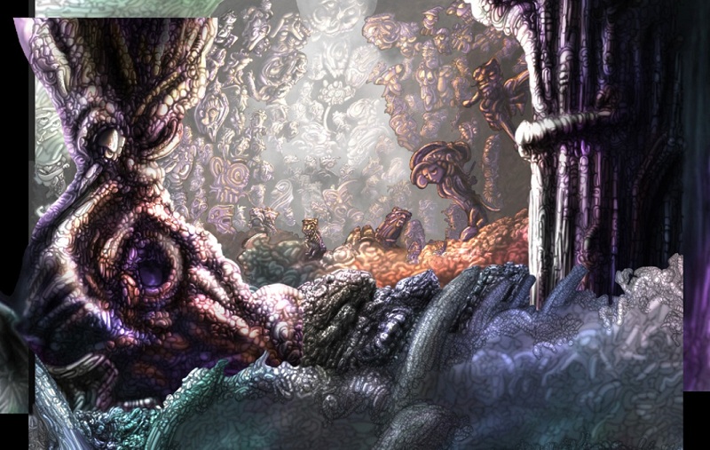
It doesn't pass quality control so I decide to integrate some kind of creepy font that consists of some of those structures painted earlier. And again it's time to cut the whole image into pieces/layers. This time in order to add some fog. Fog is quite nice to give further depth to the image without being forced to color-correct anymore.
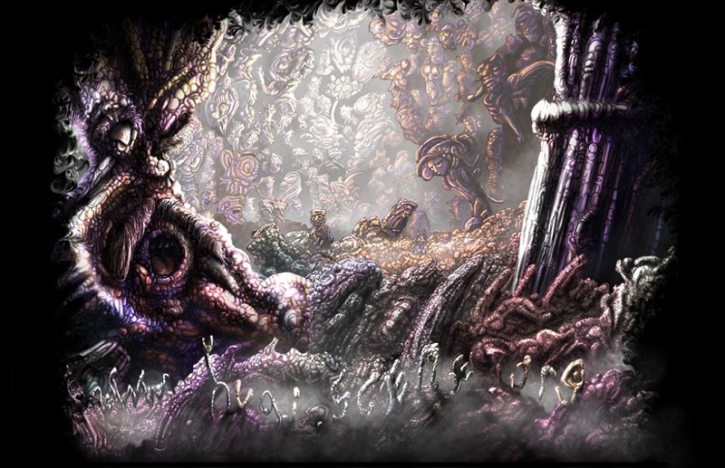
Finally it's that aspect that bothers me. Usually I paint GFXs in fullHD, not 4:3. So the whole thing needs to be crunched in some way. I take out some area in the middle of the image. It doesn't hold any useful information at all and no one will notice. Now it's time to correct some details again and erase all those artifacts that were gathered by layering the image.
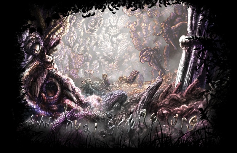
Yet another image seems to be ready. And it's full of details. there's about 120 faces. Some overpainted during the whole process. I usually don't care for overpainting some of the stuff I did. Even if it was lots of work. Hey, it doesn't work until it works. Those faces... yes. A wole bunch for my collection. There's over a thousand at this moment... and some day, one day I'll make a demo of that.
Being glad that another image is done, I usually rest for two or three days before I take the chance for a new project. Something totally different but quite such similar in style. Don't know what it is now. I will notice whilst painting.
Prince